Mastering Grid Layouts in Flutter Grid layouts have become indispensable in modern app development due to their scalability and customizable features. They strike a perfect balance between aesthetics and functionality, making them perfect for a wide range of user interfaces.
In this blog post, we'll dive deep into the Flutter Staggered GridView, a powerful package that extends the capabilities of the standard grid view in Flutter, offering more flexibility and control.
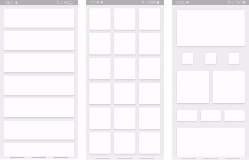
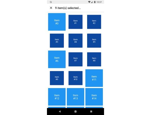
Why Flutter Grid View Matters Flutter's GridView is a scrollable grid list that arranges widgets in a 2D array, allowing developers to create clean and engaging user interfaces effortlessly. It boasts various properties to manipulate the grid's appearance and behavior, making it a versatile tool for UI design.
One of its standout features is its dynamic rendering capability, which optimizes performance by rendering only the necessary space on the screen, making it ideal for handling large datasets efficiently.
Advantages of Flutter Grid View The standard GridView in Flutter offers a responsive and efficient way to represent collections of items in a grid format. It automatically adjusts to different screen sizes and orientations, ensuring a seamless user experience across devices.
Moreover, Flutter's GridView excels at handling user input, dynamically adapting as users scroll through the items. Its ability to handle complex UI designs while maintaining optimal performance makes it a popular choice among Flutter developers.
Standard vs. Custom Gridview in Flutter While the standard GridView is powerful, it has limitations, especially when dealing with grids with items of varying sizes. This is where the Flutter Staggered GridView comes in, offering a more customizable solution for creating grids with variable cell sizes.
With the Flutter Staggered GridView, developers have the flexibility to create intricate layouts, making it the perfect choice for designing dynamic and visually appealing UIs.
Introducing the Flutter Staggered Grid View Package Overview of the Package The Flutter_staggered_grid_view package is a versatile tool for creating complex grid layouts in Flutter apps. It allows developers to implement staggered grid views with widgets of varying sizes, adding a dynamic and modern touch to their applications.
One of the package's key features is its ability to create staggered or Pinterest-like layouts, providing extensive customization options to meet diverse design requirements.
Functionality and Features The package offers impressive features beyond what's possible with the standard GridView in Flutter. It allows for the creation of staggered grid layouts with fixed and variable axis counts, providing developers with greater control over grid designs.
Additionally, the package offers extensive customization options, including the ability to control child aspect ratio and define the number of columns and maximum cross-axis extent.
Why Choose the Package? While the standard GridView widget is reliable, the Flutter Staggered GridView takes grid layouts to the next level, offering comprehensive control over grid designs. It's the perfect choice for scenarios where grids need to have items of varying sizes, delivering dynamic and visually appealing UIs.
Setting Up the Package Installing the Package To get started with the Flutter_staggered_grid_view package, you'll need to add it to your project's dependencies in the pubspec.yaml file:
dependencies: flutter_staggered_grid_view: ^0.7.0 After adding the dependency, run flutter packages get in your terminal to download the package. Once installed, import the package into your Dart file:
import 'package:flutter_staggered_grid_view/flutter_staggered_grid_view.dart'; Understanding Maximum Cross-axis Extent When working with grids, understanding the concept of the cross-axis is essential. The maximum cross-axis extent refers to the maximum width (for vertical grids) or height (for horizontal grids) of each grid item, ensuring a consistent size across the grid.
Flutter Grid Layouts and GridView Now that we've added the package and understood the concept of maximum cross-axis extent, let's explore how to create grid layouts in Flutter using the GridView widget.
There are two primary ways to create a grid using GridView: using the GridView.count constructor or the GridView.extent method, each offering unique advantages for different use cases.
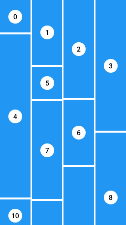
Implementing Staggered GridView in Flutter Creating a Basic Grid Layout with Fixed Elements To create a basic grid layout with fixed elements, we can use the StaggeredGridView.countBuilder constructor, which simplifies the grid creation process:
StaggeredGridView.countBuilder( crossAxisCount: 4, itemCount: 8, itemBuilder: (BuildContext context, int index) => Container( color: Colors.green, child: Center( child: CircleAvatar(backgroundColor: Colors.white, child: Text('$index')), ), ), staggeredTileBuilder: (int index) => StaggeredTile.count(2, index.isEven ? 2 : 1), mainAxisSpacing: 4.0, crossAxisSpacing: 4.0, ); In the above example, we specify the number of columns in the grid (crossAxisCount: 4) and define the width and height of each tile using the StaggeredTile.count function.
Implementing a More Dynamic Grid Layout with Varying Elements For a more dynamic grid layout with varying element sizes, we can modify the staggeredTileBuilder function to adjust the size of each tile based on its index:
StaggeredGridView.countBuilder( crossAxisCount: 4, itemCount: 8, itemBuilder: (BuildContext context, int index) => Container( color: Colors.green, child: Center( child: CircleAvatar( backgroundColor: Colors.white, child: Text('$index'), ), ), ), staggeredTileBuilder: (int index) => StaggeredTile.count(2, index.isEven ? 2 : index + 1), mainAxisSpacing: 4.0, crossAxisSpacing: 4.0, ); In this example, each tile's size depends on its index, resulting in a more dynamic and engaging grid layout.
Exploring the Cross Axis in Staggered Grid Layout An In-depth Look at the Cross-axis Understanding the cross-axis is essential for grid layouts, as it determines the width (for vertical grids) or height (for horizontal grids) of each grid item. Properties like crossAxisCount and crossAxisSpacing allow developers to control the grid's appearance and spacing along the cross-axis.
Effect of Cross Axis Count The crossAxisCount property defines the number of columns in the grid, affecting the grid's overall layout and appearance. Increasing the crossAxisCount results in narrower grid cells, ideal for accommodating more items within the grid.
Understanding the Impact of Cross-Axis Spacing Cross-axis spacing adjusts the spacing between grid cells along the cross-axis, enhancing the grid's visual appeal and readability. By setting an appropriate cross-axis spacing value, developers can achieve a balanced and aesthetically pleasing grid layout.
Advanced Usage of the Flutter Staggered Grid View Package Understanding Advanced Features The Flutter Staggered GridView package offers advanced features beyond basic grid creation, allowing developers to create complex and responsive layouts tailored to their specific requirements.
One notable feature is the ability to customize cross-axis counts dynamically, enabling developers to create different grid layouts for portrait and landscape modes. This responsiveness ensures optimal user experience across devices and orientations.
Creating Complex Layouts With the Flutter Staggered GridView package, developers can create scrollable views with headers and dynamic grid rows, offering users a rich and interactive experience. By leveraging the package's extensive customization options, developers can design professional-grade layouts that meet modern design standards.
Handling Large Datasets The package efficiently handles large datasets by employing a lazy-loading strategy, only rendering items that are visible on the screen. This optimization minimizes memory usage and ensures smooth performance, even with extensive grid layouts.
Use Case Examples of Flutter Staggered GridView Real-world examples demonstrate the versatility and practicality of the Flutter Staggered GridView package in various applications:
Photo Gallery Apps Photo gallery apps benefit from the package's ability to create dynamic and visually appealing grid layouts, showcasing images of varying sizes in an engaging manner.
Shopping Apps Shopping apps can utilize the package to display products effectively, highlighting featured items with larger tiles while maintaining a cohesive and aesthetically pleasing grid layout.
Dashboard Interfaces Dashboard interfaces can leverage the package to create dynamic and informative layouts, presenting different types of content in a visually appealing manner.
Common Problems and Solutions with the Package While the Flutter Staggered GridView package offers powerful features, developers may encounter common challenges during implementation:
Screen Overflow Issues Handling large images Aligning items of various sizes By addressing these challenges with appropriate solutions, developers can overcome obstacles and create exceptional grid layouts with ease.
Conclusion Grid layouts play a crucial role in modern app development, offering a flexible and scalable solution for organizing content. The Flutter Staggered GridView package extends the capabilities of Flutter's GridView, providing developers with greater control over grid layouts and enabling them to create dynamic and visually appealing user interfaces.
From setting up basic grid layouts to implementing complex and responsive designs, the package offers a wide range of features and customization options. By leveraging the package's capabilities, developers can create professional-grade layouts that meet the demands of modern app development.